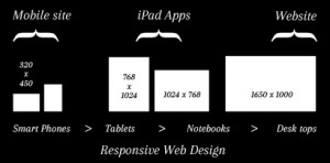
 The shift towards adaptive and responsive web design displays is becoming more widespread across the internet, but the majority of websites still only use the centre column of the screen real estate, leaving a blank white space either side of the content area wasting valuable space on the first page.
Having more space on the first page enables you to present the user as much key information as possible, without overloading.
In this article you will find a few examples of the challenges of using the full screen, and free tools and techniques out there to help you achieve responsive web design.
Challenges in achieving responsive web design
With a myriad of devices on the market these days ranging from your smartphone, iPhone, Android or Windows Mobile device, to the tablet market of iPads, Android Tablets, all having a different resolution, there is no right or wrong resolution to build your website. However there is a correct aspect ratio going forward, widescreen.
This is one thing that all of these devices have in common. A widescreen view.
When we design websites we must first take a widescreen canvas in mind. From this, you apply the basic functional navigation elements, such as a header and footer, and two containers for content in the middle.
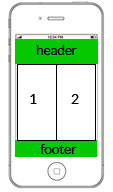
The problem we face when we have the same layout, same website on a mobile device, we get the following:
To address this, we use a great little plugin called Jquery Isotope (http://isotope.metafizzy.co/)
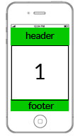
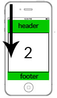
Jquery Isotope will allow the two separate containers to stack on top of each-other
In this case now, container 1 is stacked on top of container 2, so as the user scrolls down the screen can get the content in subsequent order.
HyperSmash.com
Alex Boston on Google+
Design, Technical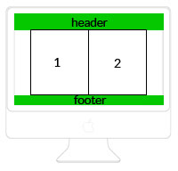


2 thoughts on “The shift toward responsive web design”