Last year krafthaus started using the collaborative organisational management tool Trello. Trello is a free cloud-based project management application made by New York-based cool cats Fog Creek Software.
Last year krafthaus started using the collaborative organisational management tool Trello. Trello is a free cloud-based project management application made by New York-based cool cats Fog Creek Software.

OK, as a number of the projects we have been working on here are ‘hush hush’ we can’t share them with you yet. So instead I thought I would share our ‘top ten’ digital trends of 2013. Hopefully in the New Year we will be able to share some of the things we have been working on, a lot of which are based on what we see as the future of digital.
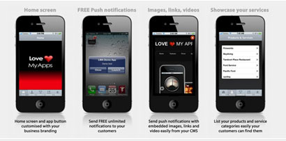
We are working on a digital strategy at the moment for a client (hush hush I’m afraid so no names) and when doing an analysis of their current digital offerings I found that one of their previous campaigns had included an “App”.

The motivation for wanting good web design quite often begins when I client has seen something online that impresses them, quite often one of their competitor sites whom they quietly envy. “We like what was done here”, and “we like the way their site does this” are common phrases you hear. But what is often discovered when we look at these sites is while they may look nice, functionality and User Experience has been overlooked.
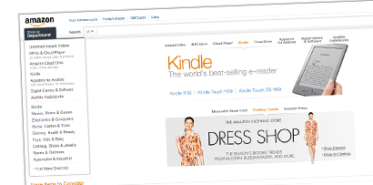
I recently bought myself an Amazon Kindle. Now originally I wanted to write a blog on how annoying it was that you can’t buy an Kindle Fire in Australia (yes I know you can get it shipped here using one of those re-direct services and hack it, but it loses most of the functionality I wanted: Netflix, HBO, Google Play, Amazon Prime).
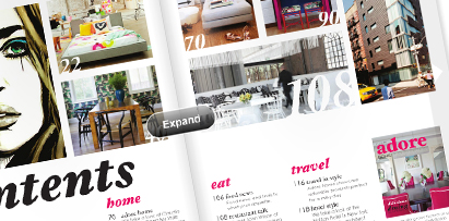
Magazine publishers. The hype, the iPad, the excitement. Was this the device their savior into the online publishing realm? Excitement was in the air, Time Magazine and a lot of the bigger publishers spent big to getting their monthly consumer publications converted into an App, to enter the Apple App store.
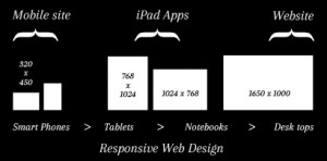
The shift towards adaptive and responsive web design displays is becoming more widespread across the internet, but the majority of websites still only use the centre column of the screen real estate, leaving a blank white space either side of the content area wasting valuable space on the first page. Having more space on the first page enables you to present the user as much key information as possible, without overloading. In this article you will find a few examples of the challenges of using the full screen, and free tools and techniques out there to help you achieve responsive Read more…
What day works for you.